Brand guide
One federation. One look. One voice.
How to use the Ghana Youth Federation name, logo, colours and typeface — for our team, partners, designers and the media.
01 · Who we are
The brand at a glance
Organisation
Ghana Youth Federation
Short form: GYF. Use the full name first, then “GYF”.
Platform
Ghana Youth App
The member app and dashboard, “by the Ghana Youth Federation”. Tagline: Connect · Participate · Get Counted.
Website
gyfghana.org
Always lowercase, no “www”, never split across a line.
Descriptor
The apex, non-partisan, youth-led body recognised under the National Youth Authority Act, 2016 (Act 939).
The official national platform for all youth organisations in Ghana.
Which name where
- Ghana Youth Federation when the organisation speaks: legal text, certificates, press releases, signatures, email “from” name.
- Ghana Youth App when the product speaks: the app, dashboard, sign-in, in-app notifications.
- Don't abbreviate the app as “GYA”, and don't write “GYF App”, “Ghana Youth Fed” or “Youth Federation Ghana”.
02 · Logo
Our mark
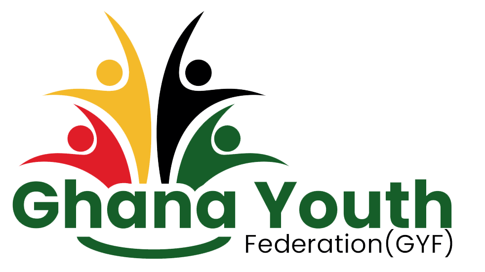
Four figures — red, gold, black and green — reaching up from a shared base: the youth of Ghana in the colours of the flag.


Clear space & minimum size
xx- Keep a margin of x on every side, where x is the height of the word “Ghana” in the logo. Nothing — text, edges or other logos — enters that space.
- Minimum width: 120 px on screen, 30 mm in print. Below that, use the icon mark.
Which version, where
- Full colour on white, cream and very light photos.
- White on GYF Green, Ink, and the darker parts of a photo.
- Never place the logo on gold or red, or on a busy part of a photograph.
- One-colour jobs (stamps, embroidery, fax): the logo in black or white only.
Please don't
Don't stretch or squash
Don't recolour
Don't rotate
Don't add shadows or effects
03 · Colour
The flag, on purpose
Green, gold and red are sampled directly from the logo. Green leads, gold lights it up, red is a pinch — about 60 / 30 / 10 with neutrals around them.
Primary. Buttons, links, headings accents, the dominant brand surface.
Accent. Calls to action on dark, highlights, emphasis words, the star.
Sparingly. Alerts, destructive actions, the flag stripe — never body text.
The black in the logo and the Ghana flag star. Print and one-colour use.
Hover and pressed states, gradients on green surfaces.
Body text and headlines on light backgrounds; the darkest hero surface.
Dark UI surfaces (footer, dark sections).
Quiet tint: secondary graphics and chart fills.
Warm page background that alternates with white on the public website.
Accessible pairings
Contrast is measured against WCAG 2.x. Use the “approved” pairs for text; the “avoid” pairs fail for normal-size text.
Approved
- AaWhite on GYF Green7.9:1AAA
- AaInk on GYF Gold10.4:1AAA
- AaGold on Ink10.4:1AAA
- AaInk on White18.4:1AAA
- AaGYF Green on White7.9:1AAA
- AaWhite on GYF Red4.8:1AA
- AaInk on Cream17.5:1AAA
Avoid
- AaInk on GYF Green2.3:1Fail
- AaGold text on White1.8:1Fail
- AaRed on GYF Green1.6:1Fail
04 · Typography
Ubuntu
Our typeface is Ubuntu — friendly, open and modern, with a confident bold. It is free (Ubuntu Font Licence) and available from Google Fonts.
Aa
Ubuntu
ABCDEFGHIJKLMNOPQRSTUVWXYZ
abcdefghijklmnopqrstuvwxyz
0123456789 & ! ? “ ” ₵ %
- Light
- Regular
- Italic
- Medium
- Bold
Display — Ubuntu Bold · 48–76 px · tight leading
The united voice of Ghana's young people.
Heading 1 — Ubuntu Bold · 36–48 px
News & updates
Heading 2 — Ubuntu Bold · 30–42 px
Five pillars. One national voice.
Heading 3 — Ubuntu Medium · 20–24 px
Youth Unity & Representation
Body — Ubuntu Regular · 16–18 px · 1.7–1.8 leading
We bring together youth-led and youth-focused organisations from every corner of Ghana.
Small — Ubuntu Regular · 13–14 px
Published 7 August 2026 · 3 min read
Eyebrow — Ubuntu Bold · 12 px · caps · +18% tracking
WHO WE ARE
- Sentence case for headings and buttons — not Title Case, never ALL CAPS (except small eyebrows).
- Put one emphasis phrase per headline in gold italic on dark backgrounds (“young people.”).
- Left-align body text. Keep lines to 60–75 characters.
- Fallback stack when Ubuntu can't load: system-ui, Segoe UI, Arial.
05 · Look & feel
Graphic elements
The flag rule
Red, gold (with the black star) and green — a thin divider at the base of heroes and footers. Use it once per screen.
Shape
Generous rounding: pill buttons, cards at 24–32 px radius. Soft shadows, never hard borders.
Photography
Real Ghanaian young people — forums, consultations, communities. Natural light, faces visible, no stock handshakes. Crop to keep people centred and avoid text on faces.
06 · Voice
How we sound
Confident, inclusive and plain-spoken — a national body that still sounds like a young person's friend.
We say
- “Join the Federation — it's free.”
- “Your group gets a seat at the table.”
- “We'll tell you by email and SMS when a decision is made.”
We avoid
- “Kindly be informed that the Secretariat has resolved…”
- Party-political language — we are non-partisan.
- Jargon and unexplained acronyms on first use.
Youth-led
Young people speak for themselves.
Inclusive
Every region, background and ability.
Plain
Short sentences, active voice.
Non-partisan
Facts and advocacy — never party lines.
Questions about using the brand?
If you're a partner, journalist or designer and need something that isn't here — a different file format, a co-branding lock-up or approval for a project — get in touch before you publish.
info@gyfghana.org